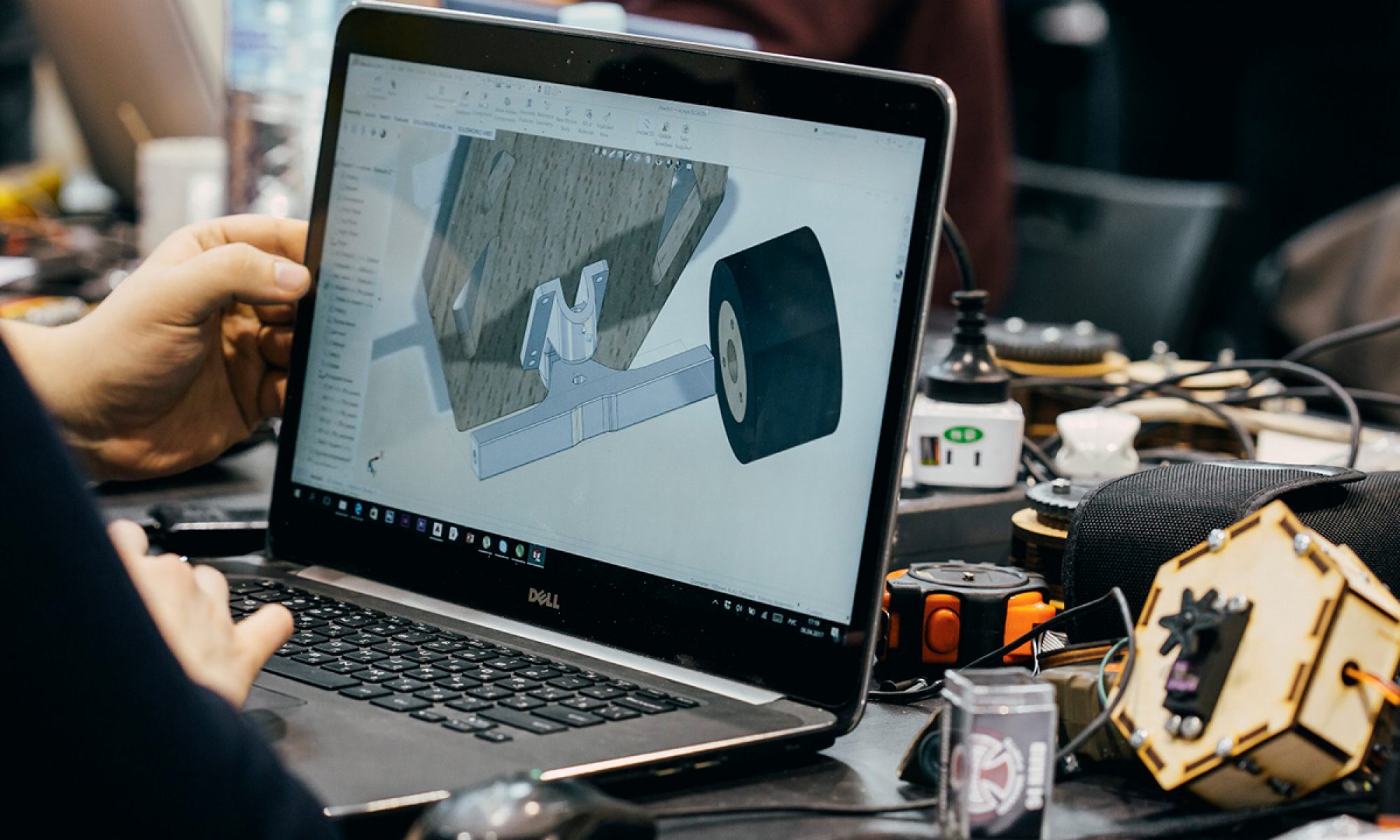
Final Prototype


4/30 – Prototype 3
4/25 – Prototype 2

4/23 – Future Dystopia Lo-Fi Prototype 1

Passion Project Update
After doing research on custom domains, including different services, brands, and prices, I decided to go with a “.me” domain from GoDaddy, since they have good brand recognition and good customer service reviews and are US based. They also provided a discounted price for the first year of the domain, so I decided to go with the yearly payment option. The domain I purchased is yahyakhan.me , so now I officially have my own website without any extra URL extensions.
– I also added a new video project to my homepage, viewable here:
https://yahyakhan.me/Still-Life

4/16 – Future Dystopia Mind Maps

4/11 – Passion Project Upate
changes:
– Updated site nav (changed location from right to left, changed buttons )
(originally about, contact, instagram > now home, work, about)
– redesigned about page to include picture, interactivity, fit on one screen without scrolling, and stack all content for mobile version
– new “work” tab which features sorting work into different categories
– added a few more projects


4/9 – Passion Project Update
Portfolio website changes:
Portfolio website changes:
- added new project (daily ui)
- added new project (plasma v1)
- added about page
- changed website theme (dark to white)
- changed background for homepage and about page (simple gradient)
- changed all fonts (one simple font now)
- changed fonts for project thumbnails on home page
- added drop shadow for images to complement light background
Remaining changes:
– Add more projects (videos, games)
– Add “work” tab with all projects and project sorting with tags
– Add more info to about page

4/4 – Thursday
Urban Intervention Final presentation:
google slides link
3/14 – Thursday Week 7
Urban Intervention Ideas


Urban Intervention Examples


Project 1 – Christopher Nolan’s Creative Process
Christopher Nolan Research Paper (google drive)
2/28 – Thursday Week 5
Passion Project Update 4
This time I created my first project page and the remaining pages will be following a similar format.
– The first thing you see is an auto-scrolling carousel of multiple presentation-style images of the project (in this case a stack of mulitple posters.)
– Following that is a list of details about the project (medium, date it was completed, who it was done for, what it was made in, etc.)
– A description of the project which includes the brief, and explanation of my design process and decisions. At least 2-3 paragraphs for each project.
– After that is a gallery of images of the project, where i customize the layout of the page. These images also have a nice fading in effect as you scroll down the page. (I decided to keep this layout for the mobile version of the size, so its just a smaller version of this same design)

2/26 – Tuesday Week 5
Passion project Update 3
This time I continued planning and organizing my site, and deciding specifically which projects I want to include. I came up with a list of specific projects which include things I’ve done as well as personal side projects.
Side note – I’m wondering if instead of uploading images for each project directly onto the website creator I’m using, if instead I should maybe upload them to my personal magnet server so that those images are accessible from anywhere and if later on I decide to stop using [Cargo collective] to make my site, it would be easier to transfer everything over and avoid any broken links. But that’s a lot of work.
- Projects
- Design
- Aftab magazine Posters
- Aftab Magazine Issues (Fall 2018, Fall + Spring 2017)
- MSA Posters
- MSA Logo + Branding
- Hyperloop Poster
- Other Logos
- Video / Motion Graphics
- Demo reel – with links to all included works
- Experimental Cinema final project + one other video
- dream video
- painting video
- Still and moving images ~ 2 projects
- emotion video (with 2 alternate versions + descriptions)
- kettle video
- Random animated gifs in one collection
- Games
- Intro to game Dev : 2 projects
- Fally ball (needs updating)
- Joust clone (remake of arcade game)
- Vector run (from creative coding)
- Intro to game Dev : 2 projects
- Design
2/21 – Thursday Week 4
Passion Project week 1 – Update 2
I continued my research and planning phase for designing my personal website. This time, I made a list of all the projects I want to include in my portfolio, and what categories they will be broken into. I know that a good portfolio highlights 3-4 key projects and they should be eye-catching and not waste anytime, but I also want to include work from different mediums that I work in. My solution for this is, after creating the main pages, creating separate “portfolio” pages for different jobs/applications ( for example, my design page would highlight graphic design, motion graphics, some video work, and maybe a few games i’ve made. My UX portfolio page would put UI design at the top, along with some research projects i’ve done, and then graphic design, etc.) but this is long term thinking.
The Categories of work I want to include are:
– Design – poster, print, editorial design, branding, logos, illustration
– Motion graphics – 2d animations, class projects
– Video work – short films, demo reel, class projects
– Games – Intro game design + creative coding projects
– Maybe other creative coding projects
– Photography? UX Research Projects?
My goal is to include at least 2 really good projects in each category, and then focus on extra projects later on. Meanwhile, I was messing around with the home page design of my site and found a cool backdrop effect that pixelates an image, then distorts in when the mouse is moved around by the user. The image is also slowly shifting around creating a wave effect.

2/19 – Tuesday Week 4
Passion Project Week 1 –
– Last week, I changed my mind and decided to switch over to doing a passion project rather than a weekly discovery log. While I was gaining useful insights about my own process, I thought my time would be better spent creating a portfolio website for myself (also because I knew if I had to do it, it would get done). I’ve broken down the project into a few steps, but there aren’t necessarily time constraints:
1 – Research phase – find the best service or tool to create a portfolio website. Compare pricing, features, and ease of access/updating.
2 – Research phase 2 – Organize and collect all the projects I want to include in my portfolio. This includes breaking them into different categories and deciding on the hierarchy of each project and what I want to give importance to over others.
3 – Planning – This is a continuation of the previous phase, where I want to continue to layout the order of projects.
4 – Basic layout and design – Create the general design of the website and decide on a theme and visual system (color, style, font)
5 – Produce project materials – Export/create project imagery and descriptions to easily fill into the website. Minimum of 4-5 pictures of each project, with ~ a paragraph of description for each.
6 – Launch website (and pay…)
For the first progress update, I decided to use Cargo Collective to create and design my website. It is a paid service for ~100 bucks a year and is competitively priced compared to other services, and offers some really nice “artsy” themes and templates that would be perfect for a design portfolio.
Metal Gear Solid Documentary Response
–
2/14 – Thursday Week 3
The Unusual Habits Of 8 Famous Creative Minds
– This article was a really interesting insight into how different creative minds approach their creative processes. One of the 8 that resonated with me the most was Trey Parker and Matt Stone, and their approach to creating South Park episodes. Specifically, what I liked the most was that their last-minute approach of creating episodes was “the inability to second guess themselves and rewrite episodes”. This is really interesting to me because it’s something I often see happening to myself when I work on a project for too long, or hesitate before starting. Instead of just diving into it I spend a lot of time worrying about how it will turn out rather than just working on it and producing a result.
The other one that I found interesting was how “Composer Igor Stravinksy stood on his head.” This was said to improve circulation and detoxify your adrenal glands. I just tried it, and it felt really overwhelming but afterwards my mind felt a little bit clearer. I’m gonna try to do this for a few days and see how it turns out.
Discovery Log #3
– This week was interesting for me in some good and bad ways. I had much smaller workload so I wasn’t too worried about completing multiple projects and stuff, but because of that I ended up wasting a lot of my free time. Sometimes at night when I haven’t done much work throughout the day, I end up staying awake later because I feel like I should get something done before sleeping (which never happens). The next day I feel sleepy and tired the whole day, which affects my productivity and I end up getting no work done. Then I fall into this cycle and it continues on for multiple days and I have a hard time falling back into schedule. I’ve been trying to eat better, more energetic food and cut down on sugar in order to escape from my lethargic physical state and it has been helping, but I really want to improve my sleep schedule and remain consistent, and avoid those productivity-free days.
In terms of design work and projects, I was asked to do a few more of those hyperloop posters (from the first discovery log) aimed at recruiting different types of students. My idea is to replace action verb in the headline with whatever kind of position the poster is representing. For example, for design students: “Help design the future”. For animators: “Help animate the future”. I still have to figure out how effective it will be and whether or not I’m giving myself too much of a workload having to design 2-3 different posters, but I want to be able to plan it out before diving into the design.
Artist Inspiration Research
– Christian Marclay
Christian Marclay is a multimedia artist who deals with several traditional art mediums such as paintings, illustration, sculptures and collages, as well as digital mediums such as video and sound. Something that immediately caught my eye in his work, particularly in his 2d art painting/collages, was his use of different sources and art styles in the same piece. (Some examples are attached below). He is using snippets of imagery from different art forms and styles, such as comic books, manga, different cultural art styles, and even different mediums such as sheet music and photography. This is really interesting to me because I have been wanting to learn more about different time periods and eras of design so I can have a better historical understanding of design principles, and then better incorporate them into my work. This is a literal take of putting in different principles and styles into a piece of work


2/12 – Tuesday Week 3
Everything is a Remix – Reading response
– I find the concept of copying, transforming and combining really interesting because it can applied to so many different mediums. When I do graphic design I often go online to search for design inspiration and collect random designs that I like and use them to mold a new design. Before It felt like this was stealing but I slowly learned that it was really important to find new influences and ideas and make them your own.
Discovery Log #2
– My exploration into analyzing my design process continued this week. I didn’t have too much to work on but I did have to make an event flyer/facebook event cover for a Muslim Students Association event later this week. One mistake I made this time was not sketching out a design or doing preparation on paper before starting digitally, and I was lost for a little while. I was having trouble aligning the textboxes, and having general trouble with text hierarchy and organization. I was just unsatisfied with my design. Once I completed the initial design, I had to come back to it the next day to change the speaker’s name, and I also ended up moving around some of the bits and pieces. Stepping away from it for a little while helped me refresh and I ended up improving the general layout of the info without changing too much, but in effect the important info in the image was emphasized better. Two pictures are attached below, one before and one after the changes (the one with the larger picture of the speaker is the updated one). Additionally, the updated design is now more modular, and lends itself better to being rearranged for different screen sizes and even a print poster layout. This is something I should keep in mind next time I am designing something for an event, or something that needs to be marketed widely, so I can save time later on and now have to change my design to have it fit Instagram, Facebook, print, etc.


2/7 – Thursday Week 2
According to the “Ten Faces of Innovation”, I think I fall into the “cross pollinator” category. I have interests in many aspects of digital media, including design, illustration, video games, film, and animation. I often find that when I’m working on projects in any one of these mediums, I can find inspiration through other mediums. For example, playing many story based video games has helped me understand narrative better, and I can use this approach when make short films or videos. Having a love of graphic design helps me understand compositions better for film shots, motion graphics, and even for game design.
Sketching/Doodling reading response-
I enjoyed reading about the importance of sketching and doodling, which many consider rudimentary methods of communication and inferior to proper “drawings” or “art”. The importance of these ideas really resonated with me because for the longest time I used to be nervous about drawing because I was afraid of it looking messy or not getting it “right”. I used to draw a lot when I was little but I stopped around high school and because of this, I stopped improving. I never really knew how to “sketch” and I always thought it was another specific, precise way of approaching drawing. After starting college I started to get back into 2d art and drawing with a big emphasis on sketching and messy drawings, just so I could have something rather than nothing. A big proponent of this was Inktober (a 30 day challenge in October during which you make 1 drawing every single day) which helped me get my drive back. I try to incorporate sketching into all aspects of my workflow now.

2/5 – Tuesday, Week 2Weekly Daily Classly Discovery Log
On the first day of class, I said that something I had trouble with in my personal workflow was having a steady and consistent workflow. For example, I do a lot of poster design but sometimes it takes me a long duration of time to finalize or come up with new designs (a lot of this time is spent just staring at the illustrator screen, unsatisfied with what I have come up with). In the past week, I did ~ 3 different posters for 3 different things.
1. Something new I tried with each one was to physically brainstorm and sketch out ideas and an input map in my notebook (which is something I avoid doing). This helped me out because I came up with different ideas of imagery and content to include in those posters, and sketching the basic layout helped me quickly put those building blocks into place.
2. I made sure to show it to a couple of my friends on messenger while I was working to get some feedback, because I often work in isolation and end up in a creative bubble.
Below are two of the posters I designed this week. (The Hyperloop one is WIP)


1/31 – First post
personal inventory – https://vimeo.com/yahyakhan/review/314584334/b29844522f
What I personally wish to gain from this class is to learn more about my self and my own work flow and become more efficient at iterating and coming up with new ideas in a smaller time frame. I’m excited about seeing other people’s creative processes and developing my own further. Currently my main creative outlet is poster/flyer designs as well as dabbling in motion graphics and after effects, so I’m always looking around for inspiration and learning new things. Some of my main influences right now are illustrators on instagram. www.instagram.com/actionhankbeard/ and www.instagram.com/zwartekoffie